Your brand identity is more than just a logo slapped on a pen, notebook, stress ball or shopping bag – it’s the personality of your business, the way it makes people feel and how it sticks in their minds long after they’ve scrolled past your Instagram post. This is where brand identity elements come in.
Brand Name & Purpose
Your brand name is often the first impression people have of your business, and it needs to do some serious heavy lifting. A great name is memorable, meaningful and aligns with your brand’s purpose – the “why” behind what you do. A strong brand name sparks curiosity, but it doesn’t stop with just the name. Your purpose gives people a reason to care. Why do you exist beyond making money? What problems are you solving or joy are you creating? This clarity brings trust, loyalty and long-term customer satisfaction.
Logo
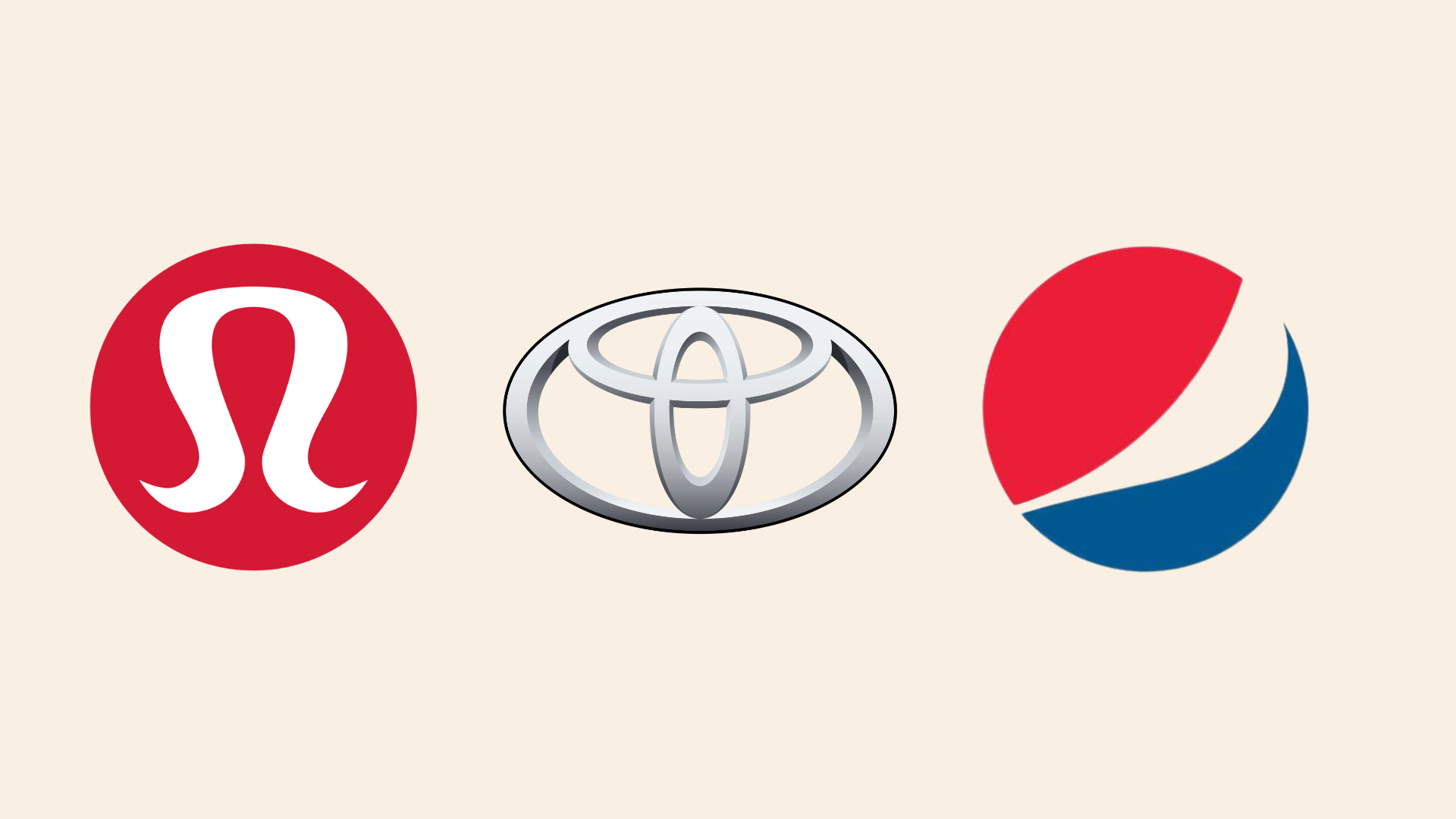
Think of your logo as your brand’s profile picture – if it looks like it’s from 2005, it probably needs to be updated. Your logo is another recognizable asset people will notice immediately. The visual cue marks familiarity. Whether it’s sleek and minimal or fun and brightly colored, your logo sets the tone for everything else. See if you can guess these three logos below:
Color Palette
Colors evoke emotions. Red screams excitement, blue whispers trust and yellow says, “Look at me! I’m fun!” A cohesive color palette makes your brand look polished and helps customers recognize you, especially when compared to your competitors. As for a quick tip, hot pink and neon green might not be the vibe for your professional business unless you’re selling energy drinks at a music festival.
Images & Graphics
The photos and graphics you use should tell your brand’s story. Crisp, clean and on-brand visuals help create cohesiveness that will immediately draw people in. Say goodbye to stock photos that look like a staged office handshake from the 90’s.
Airbnb’s style guide, for example, is so effective at defining its values because it nails it both verbally and visually. Instead of over-polished, picture-perfect images, Airbnb leans into authentic, real-life photography – cozy homes, friendly hosts and experiences that feel personal. This choice visually reinforces the brand’s mission of creating connections and making every photo a story, not just a pretty picture.
As you can see, it’s not just about having these elements – it’s about making sure they all work together in harmony. When your logo, colors, graphics, name and purpose all align –that’s where the magic happens. People remember you, trust you and (fingers crossed) buy from you.
Your brand deserves more than a mismatched logo, random colors and copy that just doesn’t sound like you. At JSK Marketing, we’ll help you get your brand elements together with a killer strategy, eye-catching visuals and messaging that actually connects with your audience. What are you waiting for? Contact us today, and we’ll make sure your brand is unforgettable.